

overview
Q is a virtual queue and waitlist app for small hospitality venues that manage walk-in customers. Instead of just showing guests their place in line, Q also helps them use their waiting time by showing nearby offers. For staff, Q has a live dashboard where hosts can manage the queue and notify guests as soon as a table becomes available.
My partner and I had two weeks to complete this. I designed the UI end to end, visual direction, design system, and every high-fidelity screen, while my partner led UX, the research, the interaction flows, and usability testing. We chose to design a queuing app for small restaurants and bars because it was a more realistic scope for a two-week project.
The BRIEF
The project brief required the app to create value for three groups, not just the end user. This pushed us to think beyond a simple queue app and consider who else could benefit from the waiting time, which led us to the deals feature. Guests have something useful to do while they wait, venues can manage their queues more efficiently, and nearby businesses can attract more customers.
Visual Direction


Logo
I started by creating the logo because I wanted to create a clear visual identity for the app before developing the design system. A lettermark made sense because a bold single letter stays clear at any size, and Q is also just what the product does (it's a queue).
Colours
After I designed the logo, I looked at how competing queue and waitlist apps, like ScanQueue, Waitwhile, and Carbonara, handled layout and colour. Most use the same safe SaaS blue, so I wanted Q to be different. That's why I chose purple (#6200EE) and deep orange (#F4511E) for primary colours. Orange connects strongly with food and hospitality, and purple makes the design feel more professional. I also used different colours for each queue status to help users identify them more quickly, similar to what ScanQueue and Waitwhile's dashboards rely on for scanability.
Typography
To complete the design system, I used Bahnschrift as the main typeface. It's easy to read in the smaller text used in the staff dashboard, but also gives the headings a strong look.
Together, these elements formed a consistent design system for the app, with components, variants, and interactions that I created in Figma.
Research & Iteration
My partner conducted the usability testing, and I used the findings to improve the UI.
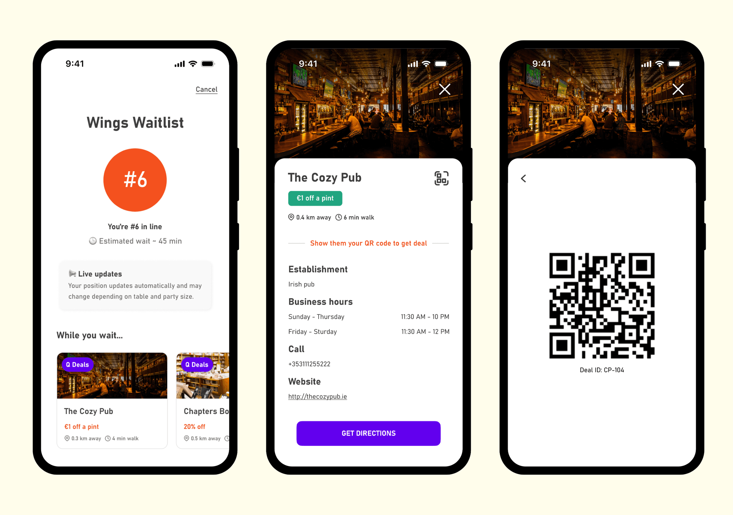
On the guest side, the "while you wait" offers looked more like generic ads rather than a Q feature, and they were competing for attention with the guest's place in line. To fix this, I added a purple badge for "Q Deals", and I changed the layout to a horizontal scroll with smaller cards. Now guests can see a few offers at the same time, they don't need to scroll as much, and the offers clearly read as optional extras, similar to Google Maps' nearby suggestions.


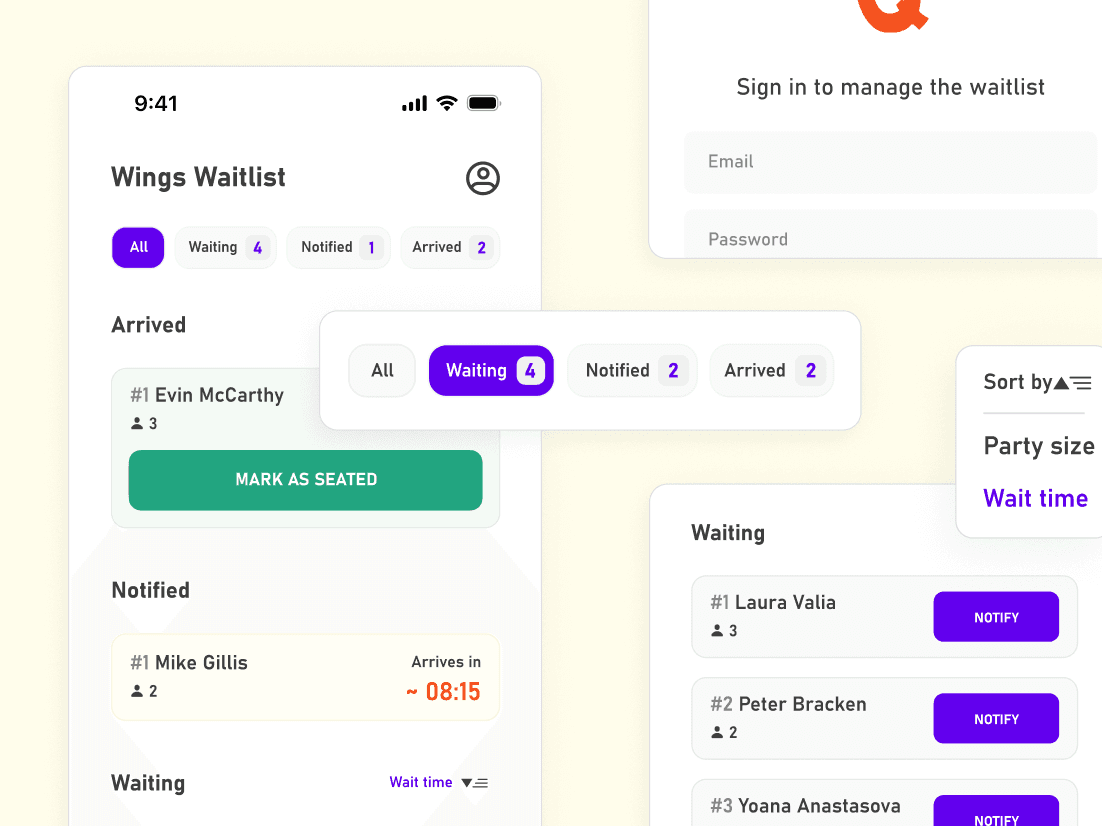
During usability testing, we also found that on the staff side hosts had to tap into each tab to count how many guests were waiting, notified, or arrived, and they weren't always sure which sorting option was last selected.
Based on this feedback, I added live counts to the tabs, I changed the "Sort by" button to show the selected option, and I made the sorting icon clearer, so users can easily understand what the button is for. I also decided to change the card layout depending on what the user is sorting by. For example, when the list is sorted by wait time, the guest's position in the queue is placed in the top half of the card, and when it is sorted by party size, the number of people in the group is moved to the top instead.
Final Design
Guest Waitlist
Guests join in a few steps and land on a live waitlist screen showing their queue number and estimated wait. When it's almost their turn, the screen changes to a 10 minute countdown with a clear warning that their table may go to the next party if they don't arrive in time. Guests can tap "I'm here" to confirm they've arrived, or leave the waitlist if they can't make it.


Q Deals
Below the queue number, a "While you wait" row shows Q Deals as small cards, so guests can browse nearby offers without losing sight of their place in line. To help guests decide whether it's worth the trip, each Q Deal card shows the offer, distance, and walking time. To redeem an offer, the Q app generates a QR code that the guest has to show at the chosen venue.


Staff Dashboard
Hosts manage the queue from a dashboard with four tabs: All, Waiting, Notified, and Arrived. Each one shows a live count, so they always know the status of the queue. We also added sorting by wait time or party size to help hosts find the right guests when a specific table opens up.


Reflection
The main challenge was having too many ideas and only two weeks to work on them. We had to choose what was most important and avoid adding too much, because this could have left us with an unfinished project.
The part I enjoyed most was designing the dashboard because there were so many different aspects to consider and balance. Also, being able to improve the tabs and the sort button after our usability testing was really satisfying because, once I made those changes, everything just clicked and made so much more sense.
If we continued developing Q, we would like to design the features we left out due to the short timeline, such as settings, push notifications, analytics, more filtering options for the staff dashboard, and a simple flow for partner businesses to manage their own deals. It would also make sense to design the app for tablet and desktop as well.