

EcoSurf
Context
USER INTERACTION DESIGN MODULE
Team Size
1
Role
UX/UI Designer
Tools
Figma, FigJam, Illustrator
The Problem
Digital tech already accounts for 1.7-2.8% of global emissions. Major platforms like Netflix, TikTok, and YouTube are designed to remove natural stopping points. Autoplay, endless scroll, and algorithm driven recommendations encourage passive, unplanned consumption with a direct environmental cost.
The BRIEF
Design two flows of a "digital footprint" app that helps users build better digital habits. The brief specifically asked for positive action without guilt or overwhelm, which is why the framing throughout (baseline screens, session summaries, etc.) avoids shaming language and instead frames things neutrally or as savings.
“How might we help users make intentional choices about their streaming and scrolling sessions, so that they can reduce their digital carbon footprint without feeling restricted or guilty?”
Research & Insights
Before designing a single screen, I analysed TikTok, Google Drive, and Netflix to understand how their interfaces shape user behaviour and where their design choices carry hidden environmental costs.
TikTok
Retention-first design; Feedback for likes and comments is instant and satisfying (heart animation, comment vibration), however, there's no feedback for time spent, data used, or CO2 produced.
Netflix
Netflix's features like autoplay, thumbnail previews, and endless recommendation rows encourage continued watching, but these design choices also raise sustainability concerns.
Google Drive
Real-time storage feedback, but no environmental equivalent. With 68% of business data never reopened, unused files carry an invisible, ongoing energy cost.
Persona
My analysis revealed that users are rarely given opportunities to reflect on the environmental cost of their digital habits. This informed the development of a persona representing environmentally conscious users whose digital behaviour does not always align with their personal values.
Maria, 24, is a postgraduate student who actively makes sustainable choices but overlooks the environmental impact of her digital habits. She struggles to control her screen time, but wants to align her online behaviour with her values.
Journey Map
Awareness
Sees a carbon footprint post an Instagram; realises she has never connected streaming to her own footprint.
Discovery
Finds EcoSurf while searching for a sustainability app.
Onboarding
Grants Screen Time access, sees her baseline, and realises: “I watch way more than I thought.”
First Session
Sets a 30 minute Netflix intention and notices the ambient timer running quietly in the background.
Session End
A full-screen interstitial stops her: "I can't just swipe this away, it's making me think about what I just did."
Reflection
Sees she saved 18g CO₂ vs her average, feels accomplished, and is motivated to do this again.
Turning research into design
Research identified two key problems: users were unaware of the environmental impact of their screen time, and they often spent more time online than intended. To address these issues, I designed the onboarding flow and the core session flow.
Onboarding flow
During onboarding, users choose which apps EcoSurf tracks, so every stat that follows (baseline usage, weekly total, CO₂ footprint) is calculated from their own screen time.
Core session flow
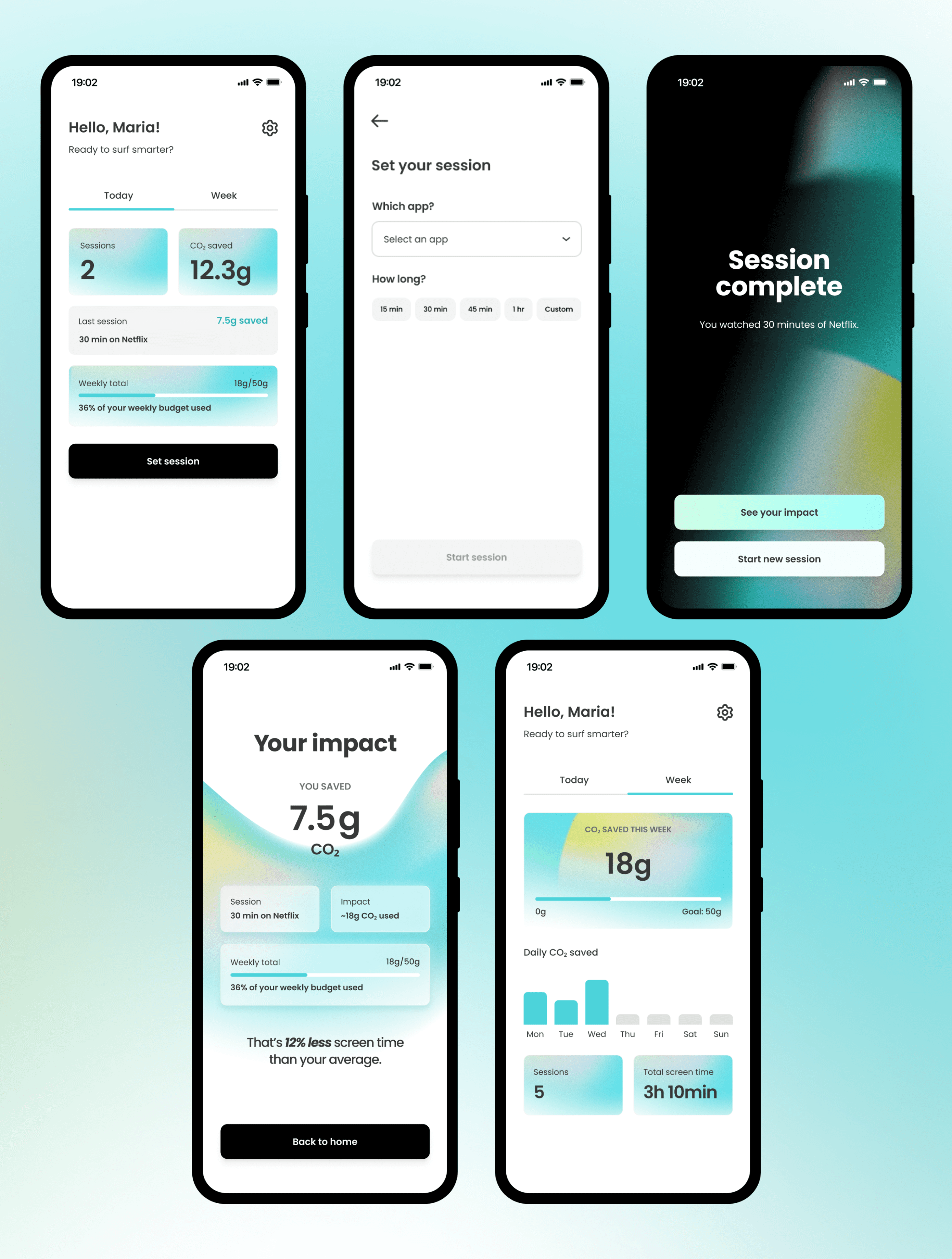
Users set a time limit before scrolling, which helps them make a more intentional choice.
Process
Before moving into visual design, I created low-fidelity wireframes to test the user flow and interaction logic.

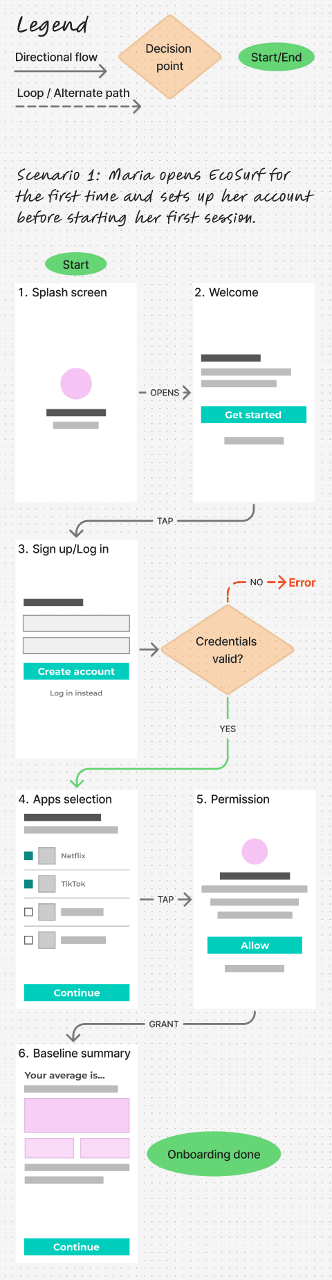


Once the interaction flows felt right, I started working on the high-fidelity design. To keep the interface consistent, I created a design system with reusable components, typography, colours, and interaction patterns.
Testing & Iteration
What validated the design
I ran structured usability sessions with 4 participants completing the full flows, from onboarding to session end. They described the Session End screen as a helpful pause rather than an interruption because it appeared after reaching a limit they had chosen themselves. Users also understood environmental impact better when CO₂ figures were paired with familiar everyday comparisons, and appreciated that the app focused on progress rather than guilt, e.g. "That’s 12% less screen time than your average."
"Because I couldn't dismiss the screen, it made me stop and think for a second instead of just continuing like I normally would."
"If this had appeared before I opened the app, I probably would have found it annoying... But because I chose the limit myself, it felt more like an alarm rather than a punishment."
"On its own, "201 grams of CO₂ a week" means nothing to me, but 40 boiled kettles I can actually imagine."
What changed after testing
Two issues surfaced repeatedly across sessions. On the app selection screen ("Which apps do you want to track?"), testers relied on reading each app name in full rather than recognizing it at a glance, which slowed them down. Separately, in two sessions testers reached Continue without selecting any apps. One tapped it by accident, the other did it deliberately just to see what would happen. Both occurrences suggested the interface didn't clearly communicate that at least one app had to be selected before continuing.
To address these issues, I added each app's official icon alongside its name, so users could recognise the apps faster, and I updated the button behaviour across selection screens. Any button that required a selection before continuing remained disabled until the user made a valid choice.

Final Design
Onboarding flow
The final design uses a light, uncluttered interface that makes environmental information feel approachable and the overall experience easy to navigate. During onboarding, users choose which apps EcoSurf tracks, so baseline usage, and estimated CO₂ footprint are then calculated from their own screen time.


Core session flow
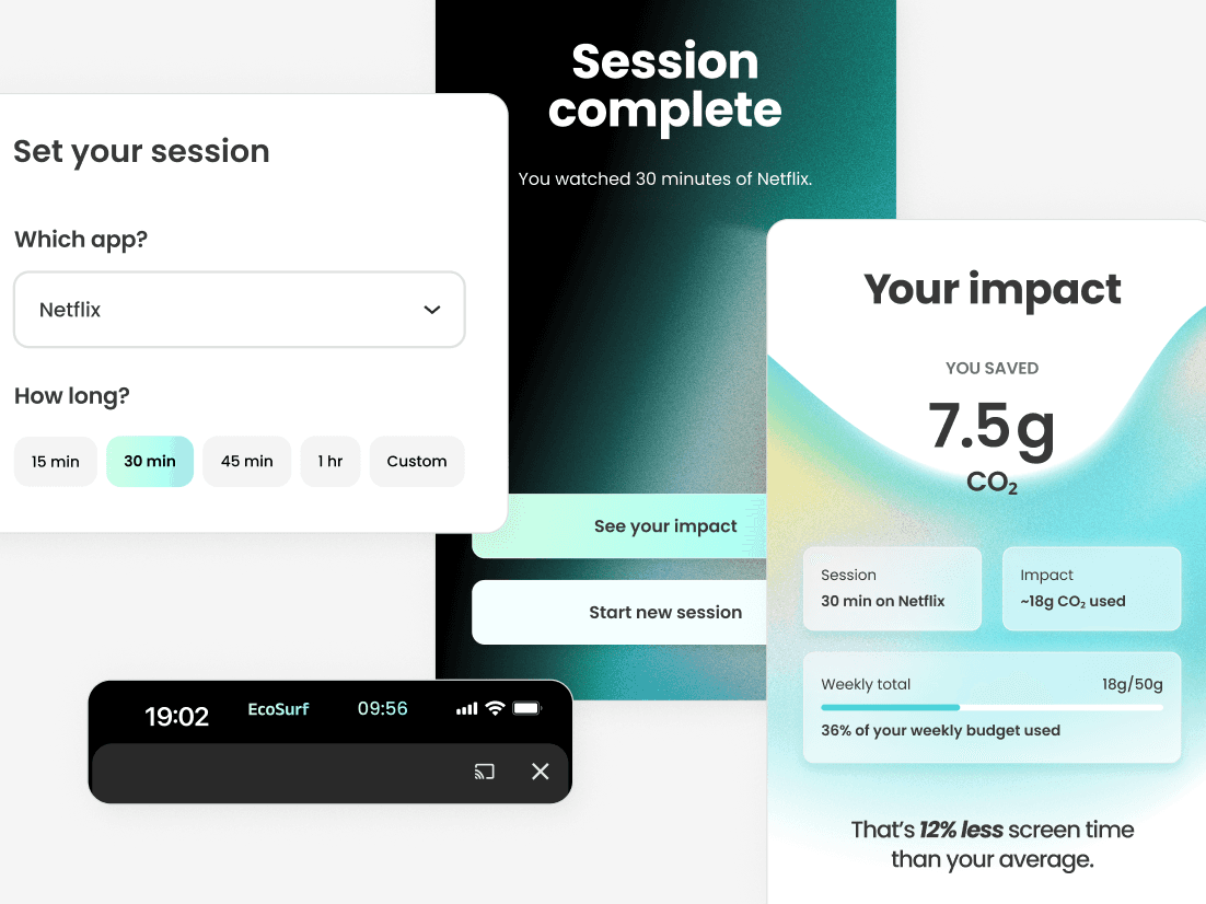
In the core session flow users set a time limit before they start scrolling or streaming, which helps them take control of their screen time and avoid unnecessary energy consumption. The interface raises awareness without creating guilt by using session summaries that highlight progress and positive changes.

Reflection
The biggest takeaway from this project was the importance of validating design decisions through usability testing. On the app selection screen, a simple list of app names turned out to be a problem I only discovered by watching people use the app. I also learned that the way information is presented matters as much as the information itself. For example, CO₂ numbers became more meaningful when paired with familiar comparisons, such as the energy used to boil 40 kettles.
The brief focused on two key flows, but if I continued developing EcoSurf, I would explore how the experience could support users beyond a single session. This would include a dedicated settings area for managing tracked apps, CO₂ goals, and notifications, as well as a session history feature to help users recognise patterns.